Advanced Layout (Custom CSS)
The Advanced layout lets you customize the appearance and behavior of ACCELERO by including your own CSS and JavaScript, applied to all pages of the system. In practice, it makes room to build a tailor-made frontend for ACCELERO — restyling colors, typography, logos, listings, and forms — just by writing CSS (and, when needed, small scripts).
The Advanced layout is a licensed module (customcss, Advanced category). The configuration screen is only available when the module is enabled in the license. See Licensing.
This resource assumes knowledge of CSS/JavaScript. The code entered is applied to all pages, so an error can affect the display or operation of the entire system. Always test carefully.
Configuration
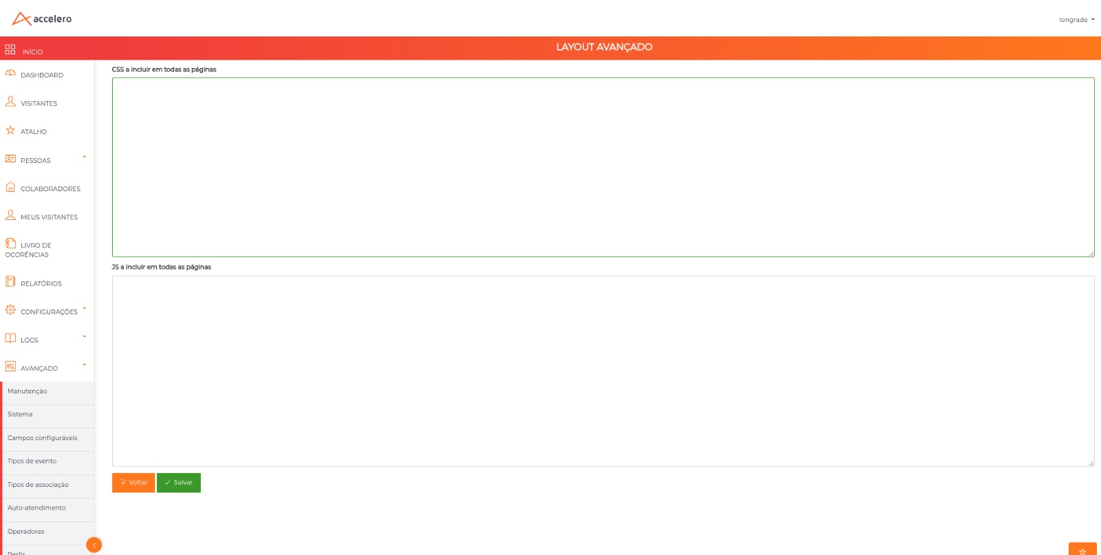
Navigation path: Advanced > System > Customization - Advanced layout
The screen presents two code editors:
| Field | Description |
|---|---|
| CSS to include on all pages | CSS styles applied to all ACCELERO pages |
| JS to include on all pages | JavaScript executed on all ACCELERO pages |
Fill in what you need and click Save. Editing this configuration requires the settings editing permission.
Where it is applied
The CSS and JS entered are included on all pages of the system — including the public invitation pages (the screens the visitor sees when tracking or canceling an invitation). A customization made here applies both to the operator interface and to the pages accessed by visitors.
Discovering the selectors
ACCELERO uses a Bootstrap base, so most elements have predictable classes. To customize a specific element:
- Open the desired screen in the browser.
- Right-click on the element and choose Inspect.
- Look at the class or id of the element and use it as a selector in your CSS.
Some useful and stable selectors of the system:
| Element | Selector |
|---|---|
| Top logo (logged-in area) | .header .main-logo |
| Top header | .header |
| Login screen logo | #loginbox .card-container img |
| Field labels | .control-label |
| Form fields (inputs/selects) | .form-control |
| Field group (label + field) | .form-group |
| Primary buttons | .btn-primary |
| Login button | .btn-login |
| Listing tables | .table |
Practical examples
The examples below are illustrative. Adjust the selectors to the screen you are customizing and test before putting them into production.
Make the whole system UPPERCASE
/* CSS to include on all pages */
body {
  text-transform: uppercase;
}
text-transform changes only the display — the text is still stored as it was typed. To force uppercase typing in a specific field, apply it to the input as well:
input.form-control,
textarea.form-control {
  text-transform: uppercase;
}
Change the logo
Replace the top logo (logged-in area):
.header .main-logo {
  content: url('https://your-domain.com/client-logo.png');
  height: 40px;
  width: auto;
}
And the login screen logo:
#loginbox .card-container img {
  content: url('https://your-domain.com/client-logo.png');
  max-width: 220px;
  height: auto;
}
Use a public and stable URL (HTTPS). If the image goes offline, the logo stops appearing.
Change the brand colors
/* Primary buttons and top bar in the client's color */
.btn-primary {
  background-color: #0a7c5a;
  border-color: #0a7c5a;
}
.header {
  background-color: #0a7c5a;
}
Hide an element
/* Example: hide "Remember me" on the login screen */
#loginbox .checkbox {
  display: none;
}
Hiding a button via CSS does not remove the permission behind it — it just stops displaying it. To control what each operator can do, use Profiles.
Highlight the listings
/* Highlighted table headers and stronger zebra striping on rows */
.table thead th {
  background-color: #0a7c5a;
  color: #fff;
}
.table tbody tr:nth-child(odd) {
  background-color: #f3f7f5;
}
Mark a field as required
Visually, you can flag a required field with an asterisk on the label. Find the field by the data-name attribute (visible in Inspect) and highlight the corresponding label:
/* Adds a red asterisk to a field's label */
.control-label[for="usuDocumento"]::after {
  content: " *";
  color: #d33;
}
The example above only flags the field — it does not prevent saving if it is left empty. Required-field validation in ACCELERO is handled by the field's data-validation="notnull" attribute. Forcing that validation on your own requires JavaScript and depends on the field participating in the screen's standard validation flow — test thoroughly before using it in production.
JavaScript example
The JS to include on all pages field allows small global behaviors. A simple example that applies uppercase when typing in a specific field:
// JS to include on all pages
document.addEventListener('input', function (e) {
  if (e.target.matches('[data-name="pesNome"]')) {
    e.target.value = e.target.value.toUpperCase();
  }
});
Scripts applied to all pages can interfere with the normal operation of the system. Use only trusted code, keep it simple, and validate thoroughly before putting it into production.
Best practices
- Evolve gradually: apply few rules at a time and check the result on different screens (listings, forms, and the invitation pages).
- Prefer stable classes: use the structural classes (
.form-control,.control-label,.table) instead of very specific selectors that may change between versions. - Document what you applied: keep a record of the CSS/JS used, to ease maintenance and diagnosis.
- Do not use it for security: hiding elements is aesthetic; access restrictions belong to Profiles and to permissions.
Next Steps
- Profiles — to actually restrict what each operator sees and does
- Global Settings — other general system parameters
- Licensing — check module availability