Dashboard
The Dashboard is ACCELERO's native overview screen. It gathers, on a single page, the current operational indicators (active people, visitors, occupancy and equipment), access charts by period and a Latest Accesses panel that updates in real time.
Navigation path: Dashboard
The Dashboard is a first-level item of the side menu (no submenu) and appears at the top of the list.
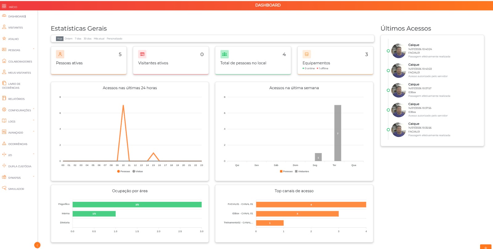
This page describes the native Dashboard, which ships with ACCELERO. There is also the Management Dashboard, a separate plugin (management_dashboard), with a different screen and different charts. They are distinct resources and can coexist.
Period filter
Above the cards there is a bar with the available periods:
| Option | What it sends to the system |
|---|---|
| Today | Selected by default when the screen opens. Does not apply a date range — the Dashboard uses the default window of each chart (see below). |
| Yesterday | The previous day (start and end on the same day). |
| 7 days | The last 7 days, including the current day. |
| 30 days | The last 30 days, including the current day. |
| Current month | From the 1st of the current month until today. |
| Custom | Displays two date fields (dd/mm/yyyy) and the Apply button. |
In the Custom period, the start date must be earlier than the end date and the range cannot exceed 60 days — the system displays the message "The maximum allowed period is 2 months (60 days)". Longer ranges sent directly to the system are also trimmed to 60 days.
Every period change reloads all cards and charts. Dates are considered from the start of the first day (00:00:00) to the end of the last one (23:59:59).
Indicator cards
There are four counters at the top of the screen.
| Card | What it counts |
|---|---|
| Active people | Enabled people who have a category link valid within the selected period (the link starts before the end of the period and ends after its start). With no period applied, it considers the current moment. |
| Active visitors | Visits (events) with started status whose start/end window crosses the selected period. |
| Total people on site | People whose current area is an area of the internal type. It is always the current value — it does not change with the period filter. |
| Equipment | Total registered controllers, with the online / offline breakdown right below. It also does not depend on the period. |
Equipment online and offline
The online/offline breakdown considers the communication status of each controller and ignores virtual controllers. When there is offline equipment, the indicator is highlighted in red and pulsing.
The large number on the card is the total of all registered controllers, while the sum of online + offline excludes virtual controllers. On installations that use virtual controllers, the total is greater than the sum of the two indicators.
Access charts
The two upper charts use the same source: log records of the "Passage effectively performed" type. That is, they count completed passages — denied attempts and other event types are not included.
In both, the series separate:
- People — accesses that are not linked to a visit event;
- Visits / Visitors — accesses linked to a visit event.
Left chart (varies with the period)
The title and the aggregation change according to the selected range:
| Period applied | Title displayed | Grouping | Chart type |
|---|---|---|---|
| None (Today option) | Accesses in the last 24 hours | By hour, over the last 24 hours | Line |
| Up to 1 day (e.g. Yesterday) | Accesses per hour | By hour of the day (00 to 23) | Line |
| Up to 14 days (e.g. 7 days) | Accesses per day | By date (dd/mm) | Bars |
| Up to 90 days (e.g. 30 days, Current month) | Accesses per week | By week (W<number>) | Bars |
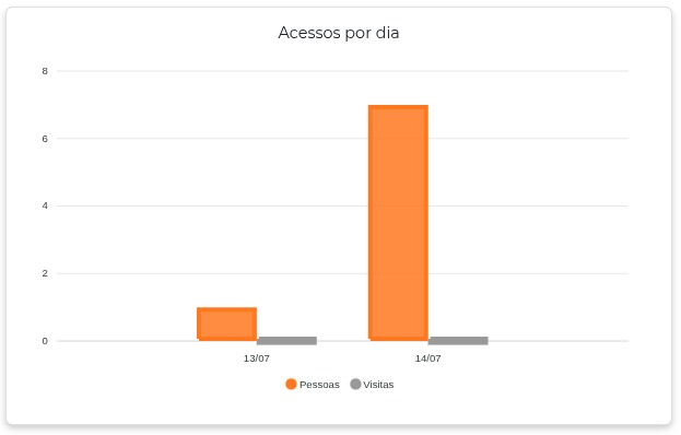
The system also provides a grouping by month (title "Accesses per month") for ranges above 90 days, but in practice the 60-day limit of the filter prevents it from being reached through the interface.
Right chart (day of the week)
With no period applied (Today option), the title is Accesses in the last week and the chart shows the last 7 days, one per day of the week.
When any period is applied, the title becomes Accesses per day of the week: the chart stops being a timeline and starts to sum all accesses in the range by day of the week. A 30-day period, for example, sums every Monday of the range into "Mon".
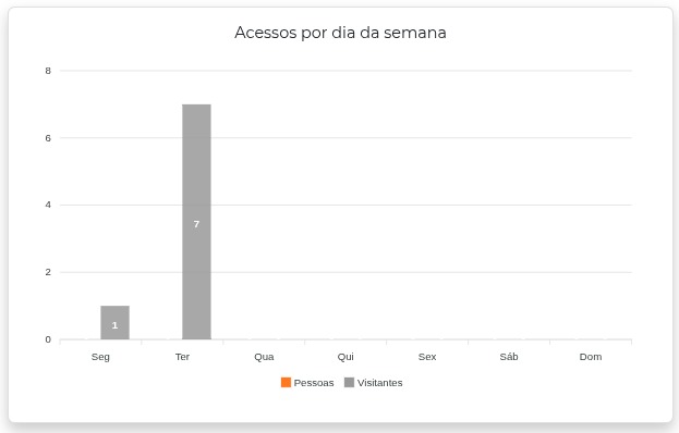
This is the chart that reveals routine patterns: which days of the week concentrate traffic, whether there is a peak on a given day, whether the weekend has relevant circulation.
Occupancy by area
Horizontal bar chart with the current occupancy of each area, in the current/capacity format (e.g. 3/5).
- Considers only enabled areas with occupancy control enabled.
- The current occupancy is the number of people whose current area is that area.
- The capacity is the maximum capacity configured in the area.
- Displays at most 10 areas, sorted from the most to the least occupied.
- The bars change color according to the occupancy percentage: green up to 69%, orange from 70% to 89% and red from 90% on.
- Hovering over the bar also shows the percentage.
If no area has occupancy control enabled, the Occupancy by area block is simply not displayed. This indicator always reflects the current moment and is not affected by the period filter.
To configure the capacity, see Areas.
Top access channels
Ranking of the 10 channels with the most passages performed in the period, in horizontal bars. Each bar is identified as Controller - Channel.
With no period applied (Today option), the ranking considers the last 24 hours. If there is no passage in the period, the block is not displayed.
Quickly identify the busiest points — useful to size equipment, review queues at peak hours and detect idle channels or channels with unexpected usage.
Latest Accesses
The right side panel lists the most recent accesses.
- When the screen opens, it loads the last 5 event log records.
- From then on, new records enter in real time at the top of the list, which keeps at most 20 items.
- Each item shows: the person's photo, name, date and time, controller and the event type description.
- When the person is not identified, the item appears as "Unknown person".
- Records of events with a failure/denial status receive distinct visual highlighting.
The Latest Accesses show any type of log record, including denied accesses and other events — while the charts count only passages effectively performed. It is expected that an event appears in the side list without changing the charts.
For the complete, searchable history, use Event Log.
Permissions
Access to the screen requires an authenticated user and the DashboardStats permission (described in the profiles as "Dashboard - Initial"). Without it, the system blocks both opening the screen and loading the data.
The native Dashboard does not depend on an additional module in the license — it is part of the ACCELERO core.
To configure who sees the screen, see Profiles.
Data refresh
- The cards and charts are loaded when the screen opens and reloaded on every period change. There is no periodic automatic refresh of the charts — to see new numbers, change the period or reload the page.
- Only the Latest Accesses panel is updated continuously, in real time.
- For performance, the indicators are stored temporarily: most for 1 minute and the online/offline status of the equipment for 30 seconds. Very recent changes may take up to that long to be reflected.
Document how the online/offline status of each controller is fed (heartbeat/keepalive frequency and what exactly marks a piece of equipment as offline). This was not confirmed in the Dashboard code — it only queries the status already published by the communication service.
Workflow and usage suggestions
Shift start (front desk). Open the Dashboard with the default Today period. Check the Equipment card: if anything is offline, the indicator turns red and pulsing — handle it before releasing the operation. Then look at Total people on site to know how many people are already inside and at Occupancy by area to check whether any area is close to capacity (orange or red bar).
Investigate a traffic peak. Select 7 days — the left chart becomes Accesses per day and shows on which date the volume rose. Then select Custom with only that day: the chart becomes Accesses per hour and reveals the time range of the peak. Cross-reference it with Top access channels to find out which entrance concentrated the traffic.
Plan staffing and resources. Select 30 days and look at the Accesses per day of the week chart: since it sums the equivalent days of the period, it shows the weekly pattern of the operation — useful to size the front desk team by day of the week.
Track visits. Use the Active visitors card to know how many visits are in progress and the Visits series of the charts to compare the volume of visitors with that of registered people over the period.
Next Steps
- Management Dashboard (plugin) — additional management panel, distributed as a plugin
- Event Log — complete, searchable access history
- Areas — capacity configuration used in "Occupancy by area"
- Controllers — record of the equipment counted in the Dashboard